
Mathematics, 27.11.2020 06:40 ten55
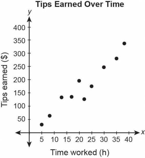
This scatter plot shows the amount of tips earned and hours worked.
Choose the statement that is best supported by the data in the scatter plot.
The data shows a non-linear association between the number of hours worked and tips earned.
The data shows no apparent association between the number of hours worked and tips earned.
The data shows a positive linear association between the number of hours worked and tips earned.
The data shows a negative linear association between the number of hours worked and tips earned.

Answers: 3


Another question on Mathematics
Mathematics, 22.06.2019 00:10
How do i take any fraction and make it into a decimal or percentage?
Answers: 1
Mathematics, 22.06.2019 01:50
If its non of them tell me..valerie took a day-trip. she drove from her house for a while and took a coffee break. after her coffee break, she continued driving. after 2 hours of driving after her coffee break, her distance from her house was 210 miles. her average speed during the whole trip was 60 miles per hour.valerie created the equation y−210=60(x−2) to represent this situation, where xx represents the time in hours from her coffee break and yy represents the distance in miles from her house.which graph correctly represents valerie's distance from her house after her coffee break?
Answers: 1
Mathematics, 22.06.2019 03:30
The lengths of the two sides of a right triangle are 5 inches and 8 inches what is the difference the possible lengths of the third side of the triangle
Answers: 3
Mathematics, 22.06.2019 03:30
Consider the diagram. lines e and c can be described as
Answers: 3
You know the right answer?
This scatter plot shows the amount of tips earned and hours worked.
Choose the statement that is be...
Questions

History, 22.06.2019 22:00

Mathematics, 22.06.2019 22:00
English, 22.06.2019 22:00

English, 22.06.2019 22:00


Mathematics, 22.06.2019 22:00

Mathematics, 22.06.2019 22:00
Mathematics, 22.06.2019 22:00
Biology, 22.06.2019 22:00
Mathematics, 22.06.2019 22:00
Physics, 22.06.2019 22:00
Biology, 22.06.2019 22:00


