
Mathematics, 01.09.2020 20:01 mathnation1
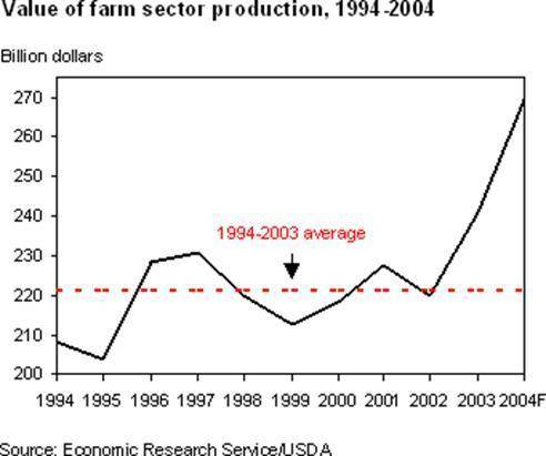
The following graph shows farm sector production in billions of dollars from 1994–2003. One line shows the yearly production and the other shows the average over the time span. According to the graph, in which 3 years were the values of farm sector production closest to the average for the 10 years shown?
A): 1994, 1996, 1998
B): 1996, 1998, 2000
C): 1998, 2000, 2002
D): 2000, 2002, 2004

Answers: 2


Another question on Mathematics
Mathematics, 21.06.2019 16:00
Abag has more green balls than blue balls, and there is at least one blue ball. let bb represent the number of blue balls and let gg represent the number of green balls. let's compare the expressions 2b2b and b + gb+g. which statement is correct? choose 1
Answers: 2
Mathematics, 21.06.2019 19:30
For what values of the variable x is the expression square root of 7x+14+ square root of 7-x a real number?
Answers: 1
Mathematics, 21.06.2019 20:00
Sarah took the advertising department from her company on a round trip to meet with a potential client. including sarah a total of 11 people took the trip. she was able to purchase coach tickets for $280 and first class tickets for $1280. she used her total budget for airfare for the trip, which was $6080. how many first class tickets did she buy? how many coach tickets did she buy?
Answers: 1
Mathematics, 21.06.2019 21:20
In 2009, there were 1570 bears in a wildlife refuge. in 2010, the population had increased to approximately 1884 bears. if this trend continues and the bear population is increasing exponentially, how many bears will there be in 2018?
Answers: 2
You know the right answer?
The following graph shows farm sector production in billions of dollars from 1994–2003. One line sho...
Questions
Engineering, 09.09.2020 20:01


Social Studies, 09.09.2020 20:01
Mathematics, 09.09.2020 20:01

Mathematics, 09.09.2020 20:01


English, 09.09.2020 20:01
History, 09.09.2020 20:01
English, 09.09.2020 20:01
Geography, 09.09.2020 20:01


