Brainliest for the correct answer and 5 full stars
eric plotted the graph below to show the re...

Mathematics, 23.09.2019 06:00 jnannsbwnw4216
Brainliest for the correct answer and 5 full stars
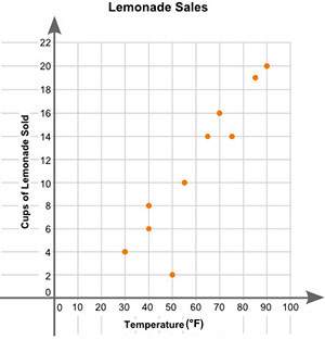
eric plotted the graph below to show the relationship between the temperature of his city and the number of cups of lemonade he sold daily:
a scatter plot is shown with the title lemonade sales. the x-axis is labeled high temperature, and the y-axis is labeled cups of lemonade sold. data points are located at 30 and 4, 40 and 6, 40 and 8, 50 and 2, 55 and 10, 65 and 14, 70 and 16, 75 and 14, 85 and 19, 90 and 20.
part a: describe the relationship between the temperature of the city and the number of cups of lemonade sold.
part b: describe how you can make the line of best fit. write the approximate slope and y-intercept of the line of best fit. show your work, including the points that you use to calculate the slope and y-intercept.

Answers: 2


Another question on Mathematics
Mathematics, 21.06.2019 17:00
Can someone me i’m confused. will give brainliest and a whole bunch of points
Answers: 2
Mathematics, 21.06.2019 19:30
Which statements are true? check all that apply. the line x = 0 is perpendicular to the line y = –3. all lines that are parallel to the y-axis are vertical lines. all lines that are perpendicular to the x-axis have a slope of 0. the equation of the line parallel to the x-axis that passes through the point (2, –6) is x = 2. the equation of the line perpendicular to the y-axis that passes through the point (–5, 1) is y = 1.
Answers: 1
Mathematics, 21.06.2019 21:00
On average a herd of elephants travels 10 miles in 12 hours you can use that information to answer different questions drag each expression to show which is answers
Answers: 3
Mathematics, 21.06.2019 21:20
Christine wong has asked dave and mike to her move into a new apartment on sunday morning. she has asked them both, in case one of them does not show up. from past experience, christine knows that there is a 40% chance that dave will not show up and a 30% chance that mik a. what is the probability that both dave and mike will show up? (round your answer to 2 decimal places.) b. what is the probability that at least one of them will show up? c. what is the probability that neither dave nor mike will show up? (round your answer to 2 decimal places.)e will not show up. dave and mike do not know each other and their decisions can be assumed to be independent.
Answers: 2
You know the right answer?
Questions

Mathematics, 12.08.2020 07:01


Engineering, 12.08.2020 07:01
Chemistry, 12.08.2020 07:01

History, 12.08.2020 07:01


